Project Brief
Cadee is a fashion company that creates each year's color palettes from outside inspiration. The 2016 Fall Line was designed based off of photography I took throughout London, England. I researched how colors become popular as well as patterns in the Pantone Color of the year. After this I developed an identity, content, photography, color palette, and illustrations. I wanted to create colors of the season, instead of a color of the year. To show my process I created a process book of all the steps I took in developing the final design. I also designed a Fall 2016 look book that shows original photography, which inspired the illustration and the color choice.
Things Considered
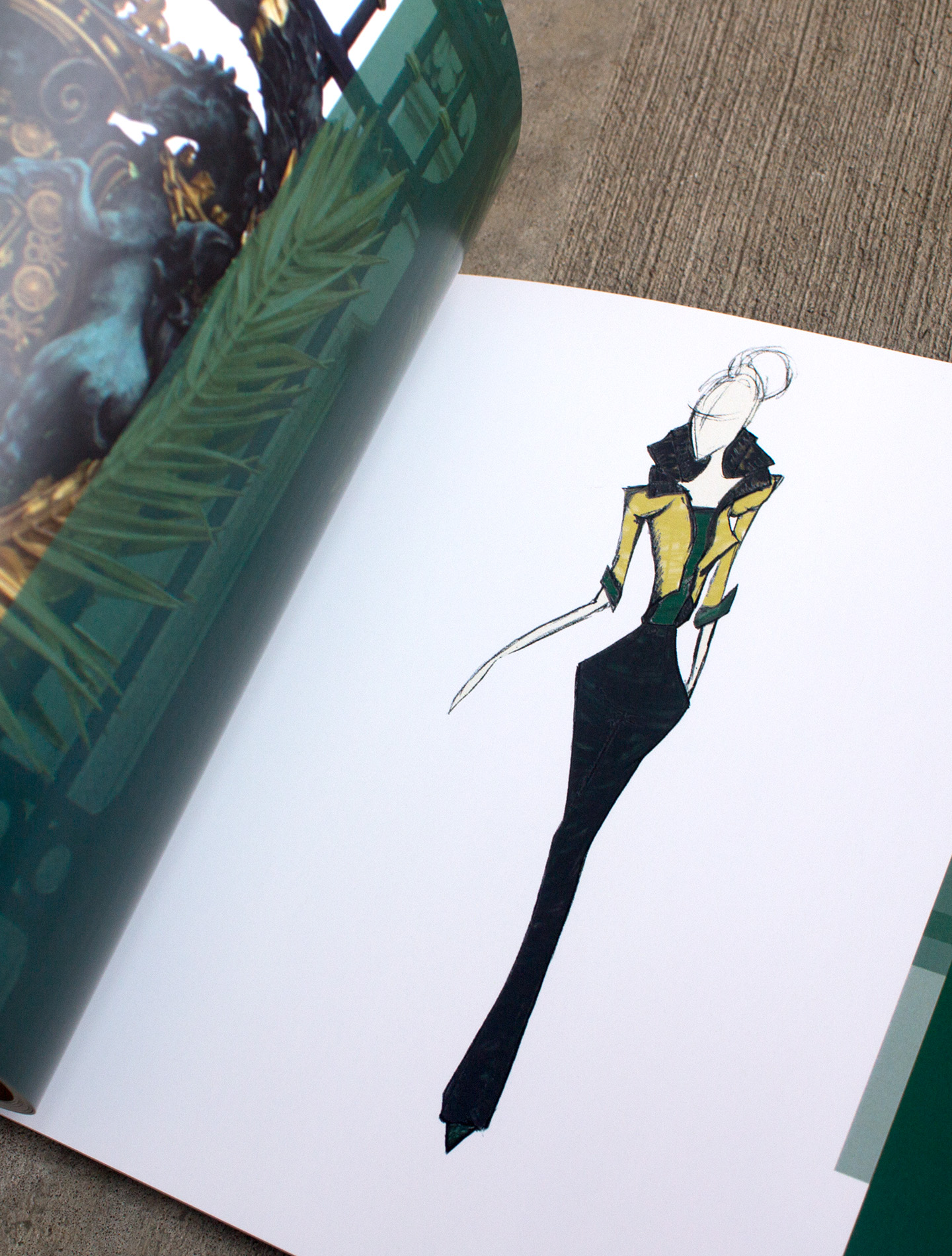
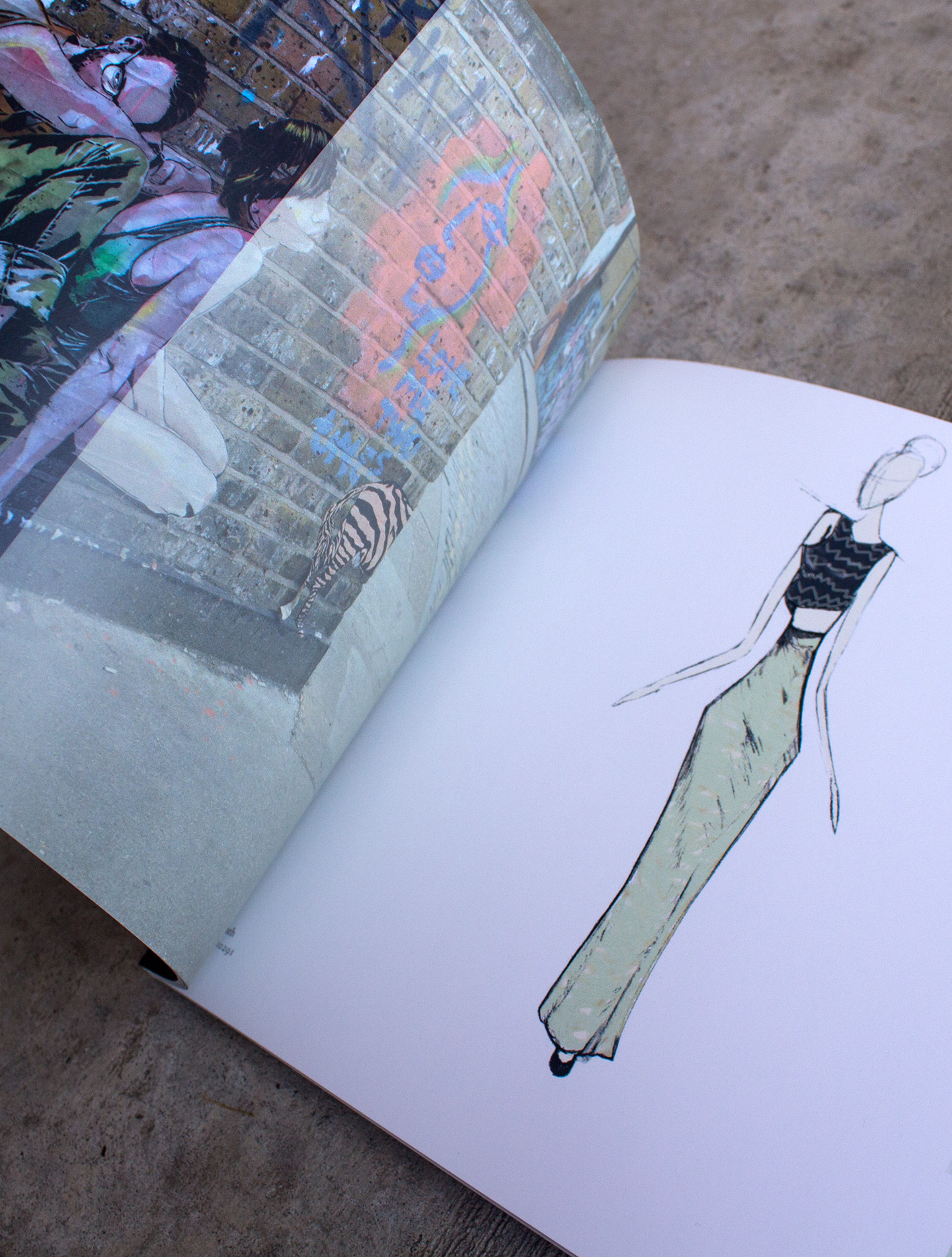
Each look was based off the coorelating image in the look book. The colors chosen were the most frequently found in the images I took around London. The fall collection is divided up into three sub categories, Uptown Chic, the Industrial Woman, and the Eastside Artist.
Identity
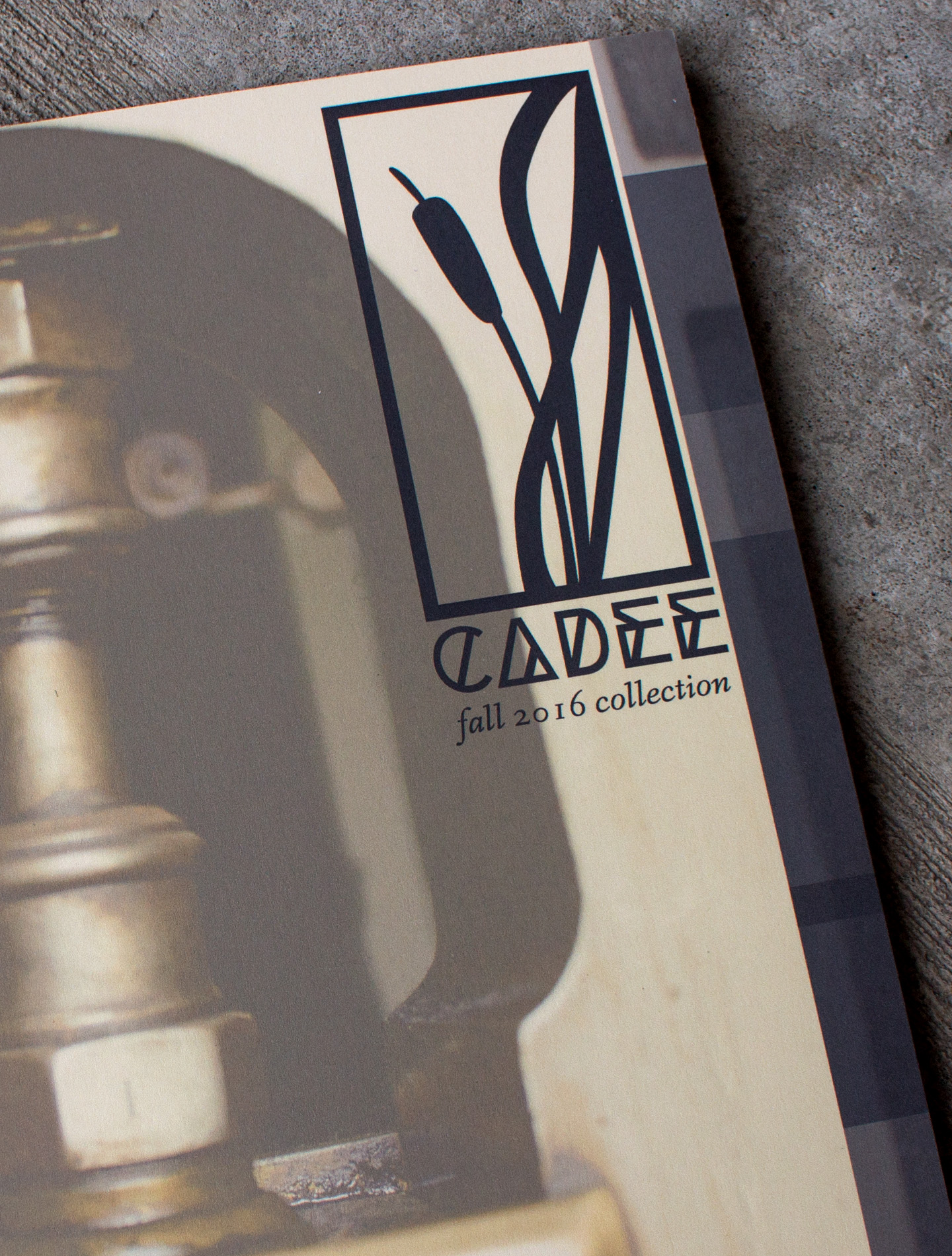
I wanted Cádee's identity to reflect the beauty and cohesivness of the designs but also the natural feel of their original sketches. The logo represents the structure of industry, found in its frame, and the integrated inspirations of nature, found in the cattails. Cádee's name was inspired by the chickadee bird common to where I grew up, their song is playful and sweet adding to how I approached the brands designs.
Colors
-
Charcoal Grey
#383b3f
-
Mint Breath
#e5c9b5
-
Jade Green
#00351e
-
Bare Nude
#e5c9b5
Project Images
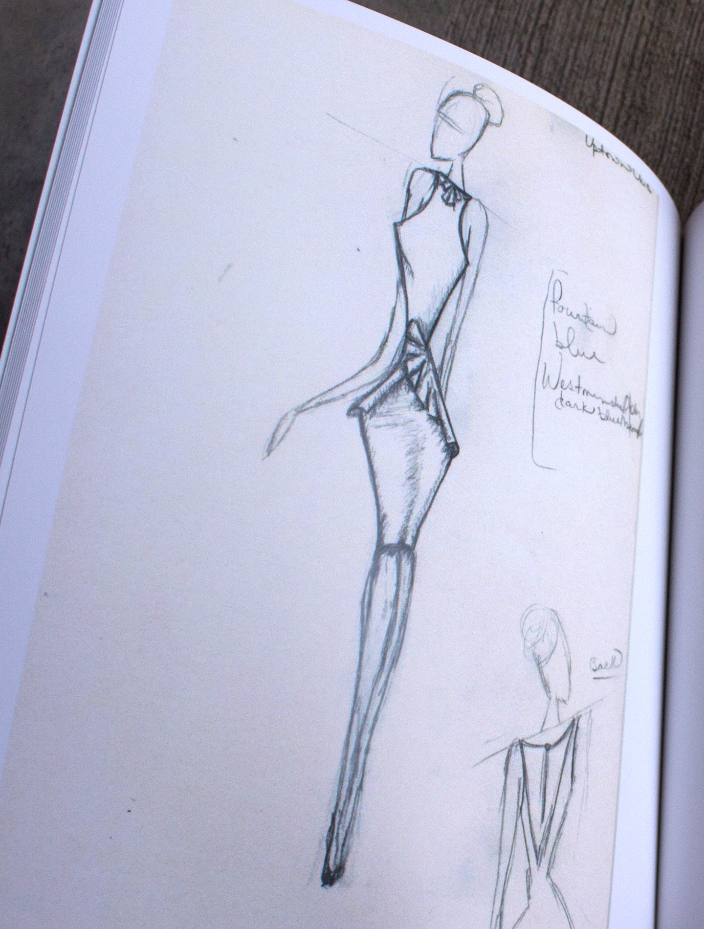
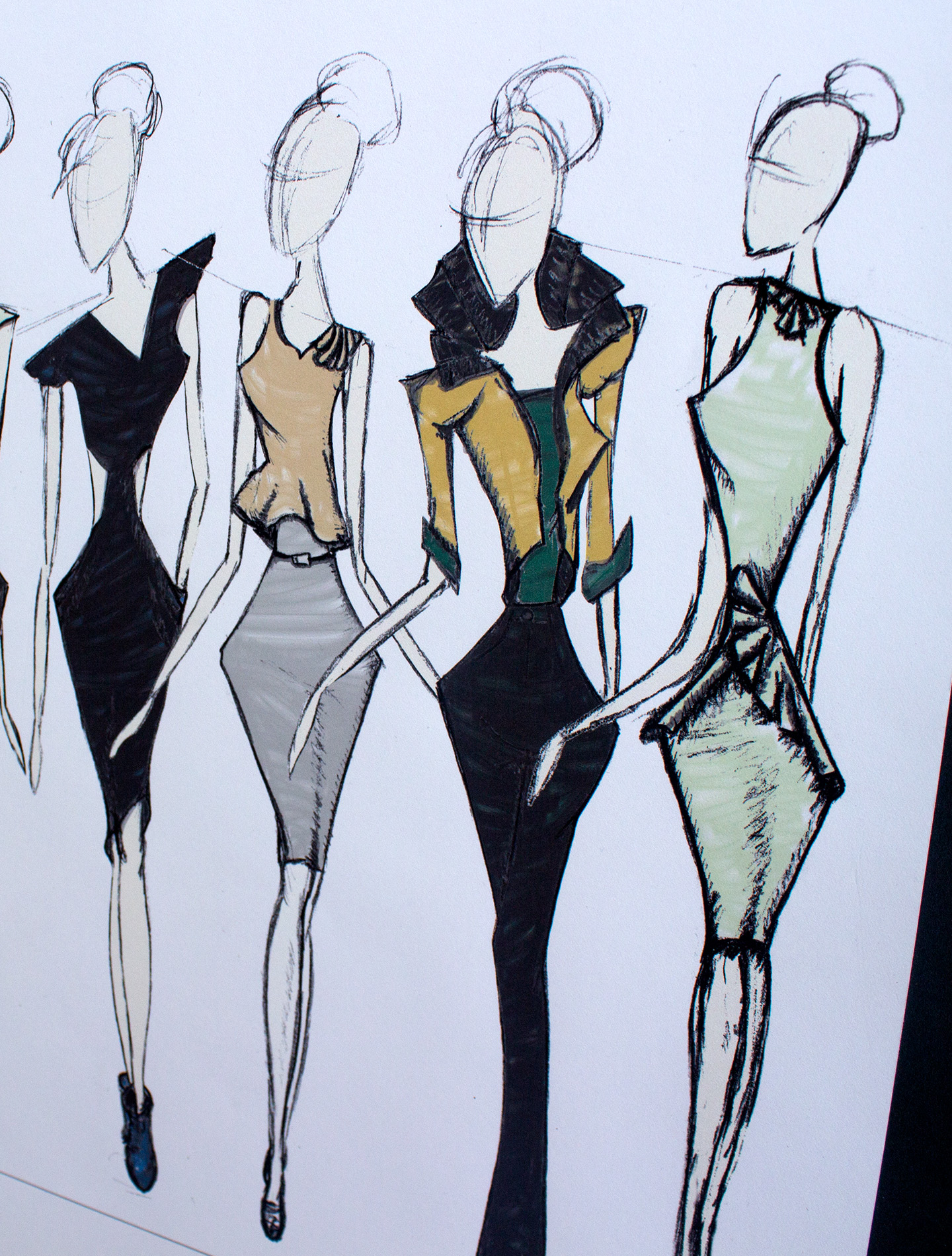
A brief overview of the process book and look book. From top left, initial illustration of clothing design. Top right, design called Beaty in Uptown Chic. Inspired by the Buckingham Palace gate. Bottom left, two piece dress named Donna. Inspired by the Brick Lane street art and hip vibes of the east side of London. Bottom right, part of the final fall 2016 lineup.
