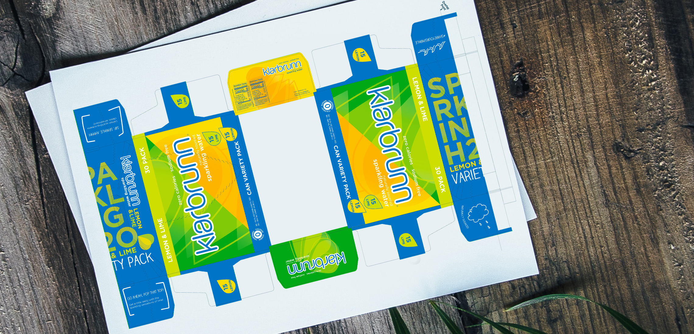
Overview
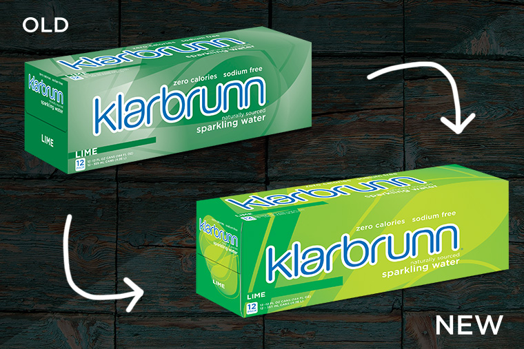
Sometimes brands, like people, need a facelift. The Klarbrunn Sparkling refresh is essentially that. Our old portfolio had colors that didn't "pop" off the shelves and needed to be brought back to our target audience. There were also issues with printing at press so when the FDA changed nutrition fact labels we decided to pump up our brand as well.
Process
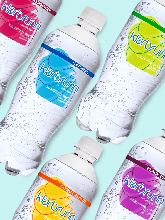
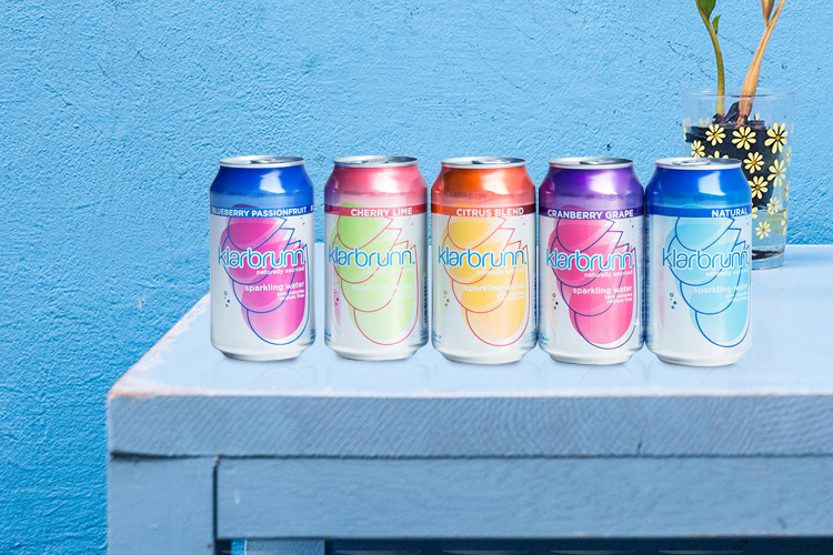
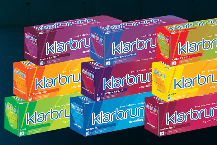
I started with a pantone book and my color book opeded in Illustrator. I made a lot of swatches and color options. Thinking about what represents what flavor, how they will print on all materials, as well as keeping them close enough to the original that current consumers won't be lost. I then applied the swatches to the can and cartons to see how they looked as a whole portfolio and then applied to the bottle labels. - The bottles have the easiest substrate to match colors on so this is why I work on these last.
Press Approvals
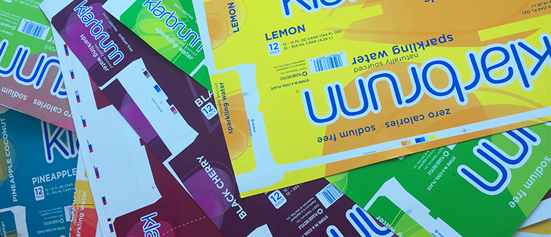
Cartons on Cartons
I am in charge of design creation, pre-press layout, communication with the printer, signing off on digital/Epsom proofs, as well as attending all press checks for the Klarbrunn brands. With our new carton plates we were able to bring the colors out more in the screen layers, creating less pulls and retries at press.
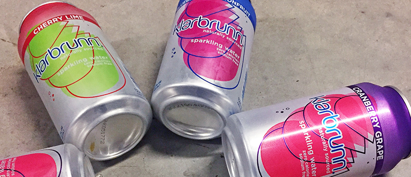
Get Canned
Matching can colors is not an easy task, especially yellows and oranges! I worked with the Ball Corp. Inx employee at the press prior to all runs to get the best color possible to match our cartons.
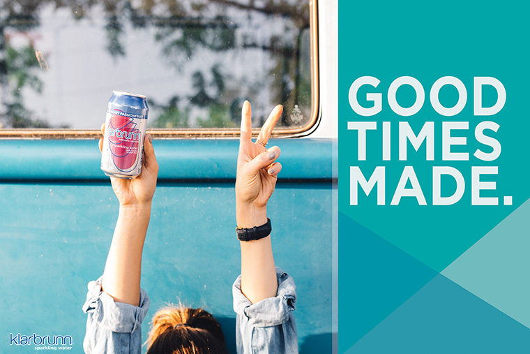
Costco 30 Packs
This was the largest change in the brand refresh. Our old 30 pack cartons had flat can images on them and looked like they could be sold at Lambeau Field as Packer memorabilia. Don't get me wrong, I do love my Packers, but the packaging needed help. The new update allows us to easily add new flavor variety packs to Costco's portfolio and pulls more of the fun, lively nature we emit on our social and in-store POS.
