Project Brief
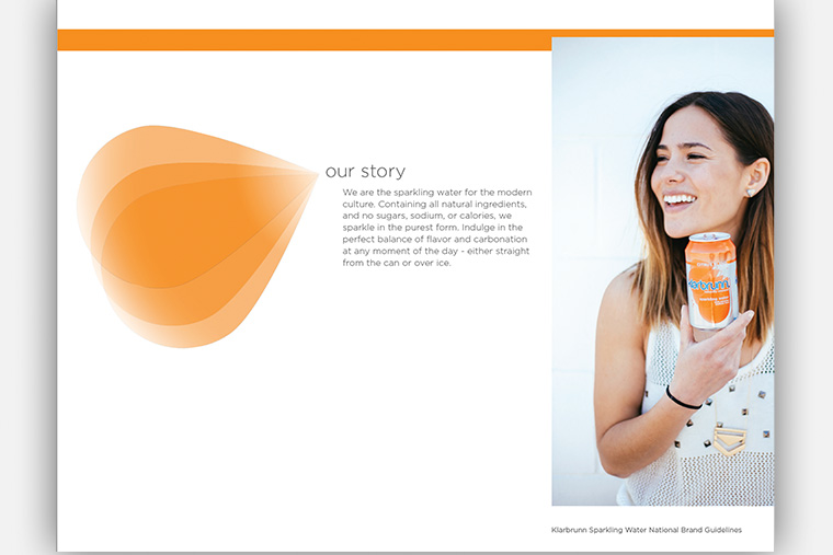
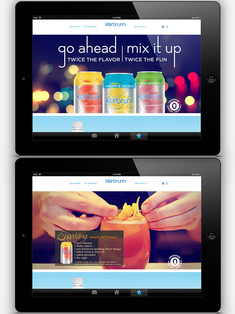
Klarbrunn Sparkling was in need of an upgrade, and with three new flavors being added to its lineup we decided to give the brand elements a facelift too. In order to develop the new look I decided to take a step back and see just who our audience is as well as check out the competition.
Process
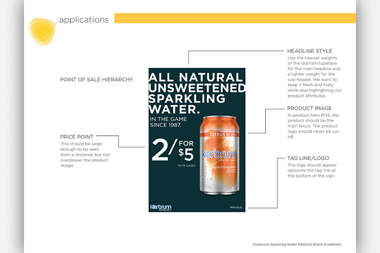
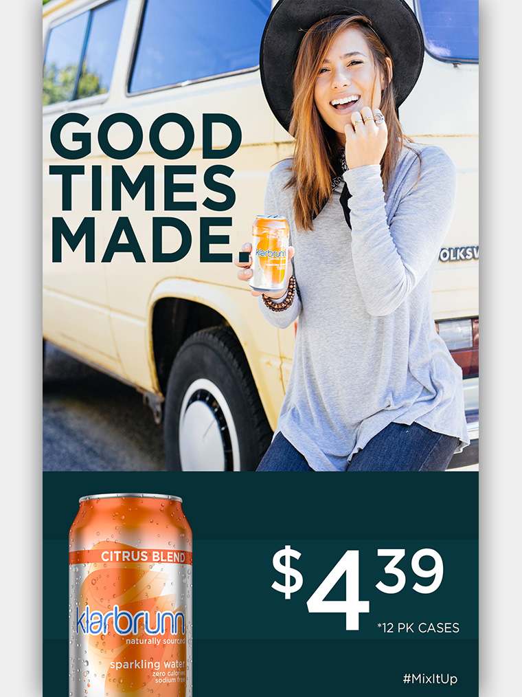
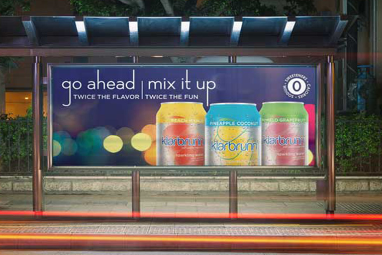
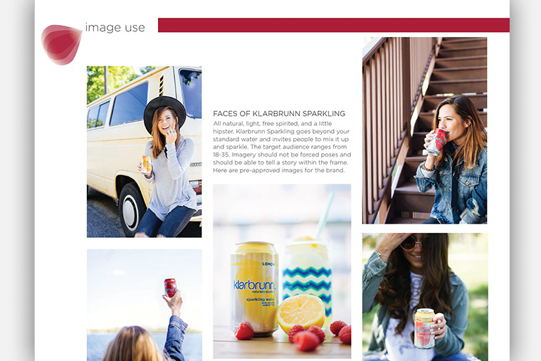
The mood boards show the brand's competition and the three categories of the Klarbrunn Sparkling feel. The categories include National Hometown, Breathe Relax Repeat, and Not Quite Hipster. Taking the mood boards and expanding their concepts, I was able to design a more structured target audience, send shot lists to a photographer, develop new in-store and OOH graphics, as well as create the brands first style guide.
Identity
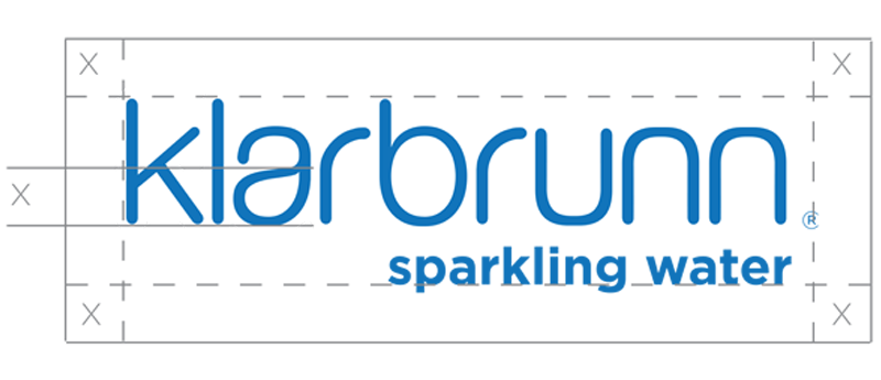
Standardizing The Logo
I created a minimum logo size and set a clear space. Because there was no standard rules set originally with this brand, there were a lot of changes with the logo and placements that were not ideal. Giving examples of what was correct and what should not be done made correcting issues simpler.

Setting Standard Logo Color
The logo needed a standard color set. We kept it simple with the blue found on our cans and cartons and use white when the blue logo is not legible on a dark background.
Colors
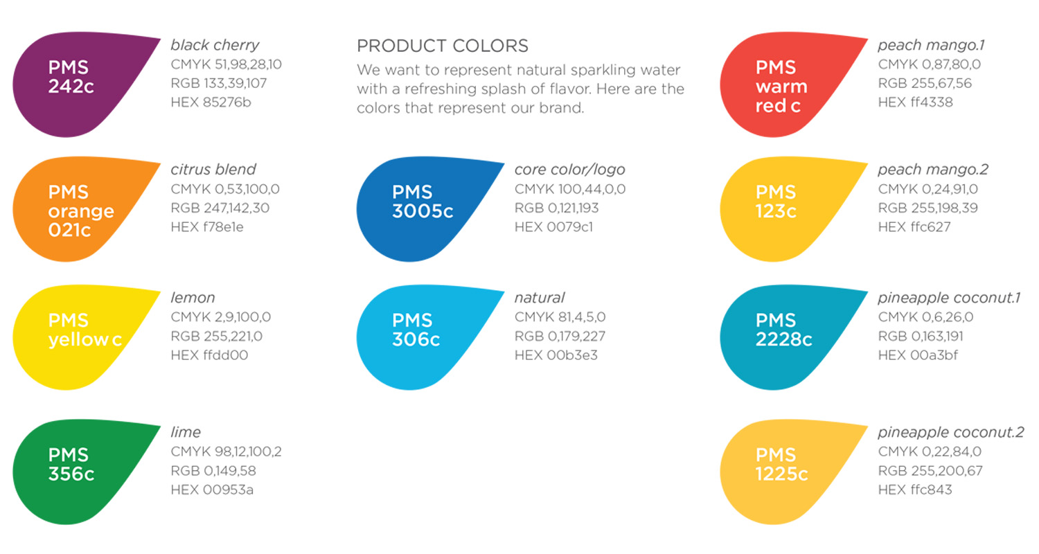
Creating pages within the style guide that laid out all product colors so that anyone could easily find and understand them was very important. Klarbrunn Sparkling did not have this and in order to find the product colors you had to open up the label files used at the printer.
Typography

Gotham

With the style guide I was able to standardize the fonts used. Gotham is the typeface that is used throughout the brand. It is open and structured in a way that adheres the naturalist goals and flavor punch feel of our brand into one. As the primary typeface, it is assigned to all communication materials.


